Every day, we process data at work; therefore, we must be able to understand and master data performance about website traffic, business performance data, and also employee management. This is something every person tries to understand and grasp information from. However, it is not an easy task to choose the appropriate graph for the right database: one that will help you illustrate, as much as possible, your indicators.

First of all, a brief definition of reporting is necessary. The word “Reporting” refers to a family of Business intelligence tools, designed to ensure the execution, publishing, and distribution of activity reports in an already predetermined format.
Over time, large companies have acquired as much data as there are dead in Q. Tarantino’s movies. A mountain, so to speak. This is due to the last decade’s legacy of massive investment in data collection: The Big Data Rush.
Today, the challenge lies in the ability to use the available data. However, the difficulty in so doing resides in the fact that we know neither how to extract that information, nor make them actionable.
In short, reporting is quite embryonic or non-existent in the majority of institutions. The reason for this is because, up to date, business intelligence tools have been used and addressed only to data processing expert users. In addition, there are fewer training courses on topics such as data recovery, and the workers or operational staff are often left on their own, to work things out.
This is where this article on data visualization makes sense. Knowing how to adequately present information, is an important asset of offering your team, the ability to understand complex topics at one glance. Whether it is for performance control, communication or presentation purposes, this approach makes it possible to democratize access to data for all the members of an institution.
Experts, decision-makers, operational or photocopy managers, whatever tools you use to present your data, we want to share with you, our experience and expertise on the topic.
This is why, in this article, we will answer the following two questions :
- What is good reporting?
- What are the best graphics to represent your data?
How to build relevant reporting?
Choosing the type of graph to use, to represent your data in business is not an infused science, and, we do not advise you to rely on Jammy Gourmand to help you on this topic, for, even the biggest of wells of science have their limit. Choosing a poor visualization, therefore, can lead to audience confusion or data misinterpretation.
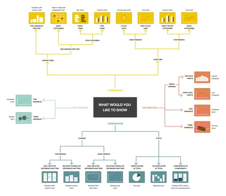
Here are 5 steps you need to keep in mind when building your graphics
Step 1: Prioritize your indicators
First of all, your reporting must be clear and evident when reading. This means comprehensiveness is your first enemy. Too often, the lack of objectives planning, causes us to create graphs with all of our available data. This results in unreadable reporting, which is as irrelevant as Franck Ribery’s intervention in a press conference. The reader will, therefore, be lost in the face of these complicated graphics and might be under the obligation to perform one of the information to remember. You will definitely not be communicating the appropriate information.
It is therefore vital that you define your audience, their needs, and select the most important indicators. Once defined, stick to your perimeter, and any ideas coming out of your scope should be addressed in a new reporting.
Step 2: Schematize and test your graphics
During this second step, do not invest your efforts in the results. Make paper diagrams with real indicators. Speak with your audience, and define with them, the improvements to be made and the usefulness and value of the graphics you are building.
Iterate as much as possible, until you come up with a relevant reporting, and keep in mind that, to create a good dashboard, one rule is relevant: a graphic = a message.
Step 3: Integrate your data
Once you have prioritized your indicators and schematize your graphics, it is time to integrate data volumes, following the graphics and message you have defined. This might lead to surprises or questioning the results, and this is an opportunity to renew your feedback process with your employees or associates.
Step 4: Tell a story
If you can quite remember, a graphic = a message; therefore, data visualization should not stop only at curves and bars. What we call data storytelling, is the ability to tell a story with data, with the aim of simplifying its understanding.
This phase requires a thorough contextualization: comments, a legend, suitable colors, a glossary… Allow your interlocutors to fully understand the message you are conveying. Got it?
Step 5: Good reporting is actionable
Whether it is for the management of commercial performance or financial communication, it is important to present your department’s performance indicators in a way that will lead to taking action.
For example, let us imagine the financial department has not achieved its objectives. How possible is it to help them? What were the performances at n-1? Is a problem of seasonality or under-performance due to the absence of one of the sales representatives? Collect the data and share them into action points.
REPORTING: CUSTOM CASES
How to show a connection between multiple data?
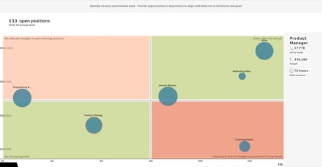
1. Bubble Chart
Objective: The bubble chart allows you to connect three indicators, to illustrate correlations. It is useful to compare complex sets.
Application: Bubble graphs are generally used to compare and show the correlation between labels and categories, through the use of positioning and proportions. So, you can use the bubble chart to analyze patterns/correlations.
The use of too many bubbles can make the reading of a graph difficult. This, therefore, means that the graph has a limited data volume capacity. However, this can be overcome by interactivity: clicking on bubbles can reveal hidden information and getting in-depth details.
For example: Here Bubble Chart relationships between different houses of Game of Thrones. By clicking on the bubbles, it is possible to discover precise information on the actions carried out by the various protagonists of the families, and their impact on the relations between them. Data viz is comin’.
2. Force-directed graph
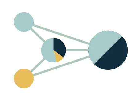
Objective: This graph is ideal to help you analyze networks or links between multiple entities.
Application: Although this graph is often complex to put up, it is unique because it helps identify links between channels, in terms of volume or flow, and it allows two-to-two comparisons.
3. Bar and line chart
Objective: This chart is singular in the sense that it helps correlate volume and variation.
Application: This chart is not the most difficult in application. As a matter of fact, it is ideal in the sense that, the superposition of the bar chart and the line chart allows the correlation of a volume and a variation.
What is amazing about the line chart is that it reveals all trends or progress over time, and it can be used to show different categories of data. You can, therefore, use it to expose a set of continuous data.
This graph is relevant if you want to have two metrics having different value scales : 3% and 3 000 k€. For example, you can use this combo to evaluate your energy consumption over time, while evaluating its evolution.
4. Scorecard
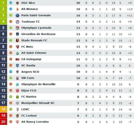
Objective: This graph offers the ability to illustrate dozens of indicators that have little to no direct correlation amongst each other.
Application: The theory stipulates that this graphic be used as a last resort only. To DataViz purists, this graph does not actually bring true value in terms of reading. So, this graph should be used to present data of different values and units.
One best-renowned example of a scorecard graph? Ligue 1 weekly classification, a scorecard with a label corresponding to each team, and several KPI’s, corresponding to earned points, games won, goals scored, etc.
This scorecard is obviously no longer up to date. Toulouse, ahead of Lyon, do you believe it?
You can now shine in your evening football games, by naively asking “What is the scorecard after the 5th day?”, while sipping your tepid kro.
How to compare your data?
1. Bar chart
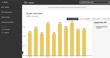
Purpose : This chart is relevant in the classic or conventional comparison of volume or flow, and the dimension can also be temporal.
Application : It is advisable to use multiple indicators in the same group, if you want to have the ability to compare your data. Always keep it simple, and do not compare more than three indicators at once.
The link speaks for itself, the statistics are glaring…
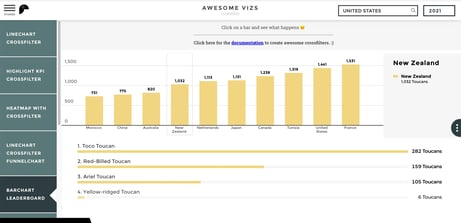
2. Horizontal Bar chart
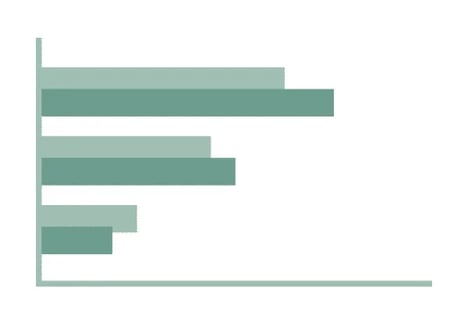
Purpose: This data visualization gives the ability to compare entities with each other, such as the performance of a company, compared to its competitor.
Application: a horizontal histogram like this one can be used when there are more than 10 labels to compare. This type of visualization can compare up to 03 types of different data.
3. Centered average leaderboard
Purpose: This leaderboard is ideal for comparing volume or flows indicators, per entity and based on an average.
Scope of application: You can use the par average to represent your performance data. It can also be used to compare multiple entities or individuals’ performance, against a precise objective.
Generally, this type of graph is used to study a distribution (gender, age, socio-professional category).
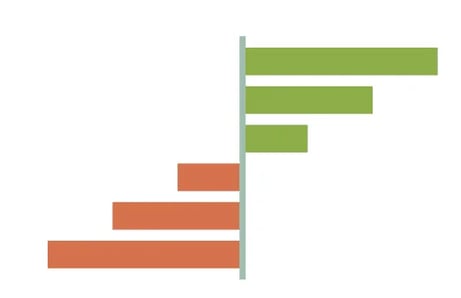
4. Slope graph

Purpose : If you wish to show the trend of a variation between a date t and t+1 per entity, this is the graph to use.
Application: This graph analyzes the evolution between two situations. What we mean is that, the more your bars are intertwined, the more the initial classification or ranking will be upside down.
This visualization is used to trace various data and is ideal in comparing a variety of variables and assessing the interconnection between them. For example, it will be useful if you would compare the performance of a wide range of products over two years.
In the example provided by our cocotte, we study the evolution or development of the percentage of women who have been playing video game for the past 04 years. A questionable statistic arises when we know that Candy Crush and Angry Birds are considered as video games. Good ol’ days are gone my friends, good ol’ days are gone…
5. Bullet chart
Purpose: Bullet chart is the objective comparison graph or instrument.
Application: The yellow bar can be used for the goal, while the horizontal one can be used for the current or ongoing performance.
This graph is relevant in the sense that it shows the progress of the indicator towards a specific goal. You have therefore the ability to compare this measurement to another one and provide a context in the form of performance or rate.
If you are setting goals on a sales project, or a marketing team, this is the relevant graph to use. However, it can also be used for personal goals like the number of Tinder dates accumulated over a month VS the expected number. Oh yes, we went there!
6. Heatmap
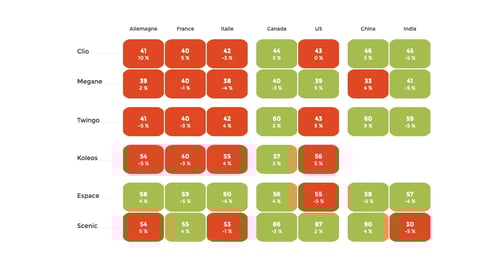
Objective: This heat map helps you acquire a global vision on combining several indicators and entities. It is also ideal for cutting through data.
Application: A heat map visualizes data through color variations. As a matter of fact, this graph is useful for cross-referencing a variety of data, placing variables in rows and columns, and coloring cells in the table.
Heat models are quite effective to show variations between multiple variables. It acts by revealing all the models available, showing forth similarity between variables, and detecting any possible correlations between them.
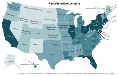
7. Cartography
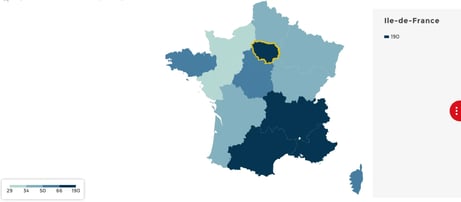
Purpose: Its primary objective is to visualize indicators in their geolocation.
Application: This cartography is ideal for representing geolocation data combined with performance data.
Mapping is used to display divided geographic areas, colored regions, or shopping center plans, relative to a variable data. Thus, making it possible to visualize values over a geographical area and to display variations or trends.
A good example is this map of the favorite artists of our American friends by State. Despite the domination of MCs, Jay-Z, and Drake, the presence of our Frenchies, Daft Punk is noteworthy, cocorico.
How to show temporal data?
1. Line chart
Purpose: Generally, this visualization is used for temporal data.
Application: Line graphs or charts are used to display a quantitative value, over a continuous duration.
Concerning this chart therefore, most often, it is used to show trends and interconnections. Line graphs also help to provide a global vision of a given interval, to assess its growth over a certain period of time.
When using a line chart, it is advisable to limit the chart to 3 lines, to keep the reading simple and easy.
A shouting example is the evolution of the presence of women in different professions. Note that the only business that has been steadily declining since 1983 is IT.
2. Timeline
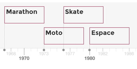
Purpose: This graph is generally used when representing a significant event for an institution or a particular individual.
Application: This timeline can be used to graphically represent an individual’s biography or an institution’s history. This can be done by selecting the most important data, to keep the vision clear and simple.
3. Stacked Bar chart
Objective: This chart has a primary purpose to divide the total volume of an entity into several categories.
Application: This graph is used to compare categories of an entity with each other. Thus, making it easy to notice the strengths and weaknesses of each subset and their impact on the activity of a department for example.
4. Waterfall
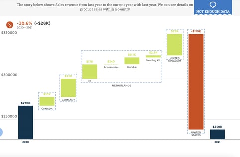
Objective: Commonly called the Mario Chart because of the bricks in suspension, the Waterfall is ideal to illustrate workflows.
Application: On a more serious note, the waterfall graph makes it possible to understand the accumulation of positive and negative values over a given period.
A waterfall chart is easily used to show how an initial value is affected by intermediate values, positive or negative, and then resulting in a final value.
It can reveal the composition of a result. For example, this chart can be useful to understand the impact of different stores on the overall income of a company in supermarkets.
Watch this tutorial video to create a Waterfall chart with Toucan Toco.
5. Treemap
Objective: Its primary objective is to facilitate the viewing of hierarchies or complex structures.
Application: Treemap is an easy way to visualize a large directory of data and variables, using too much space on the screen.
It is a more compact and efficient option for displaying hierarchies, thus giving a quick overview of a structure. It is also a relevant means of comparing different entities.
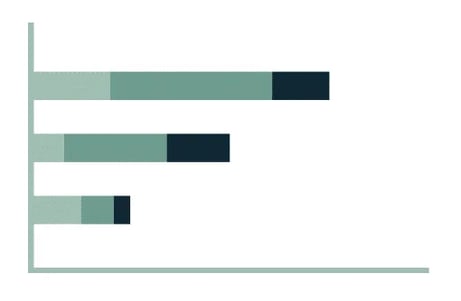
Verbatims
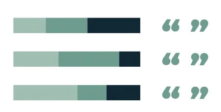
Objective: It helps you illustrate your performance with the client verbatim and explore data in text format.
Application: It presents comments by category, as well as a graphical representation of their distribution.
Data storytelling: tell a story with your reports
1. Contextualize
Good reporting is nothing without context. Therefore, to make it appealing, add comments, sources, units, captions, glossaries…
2. Enrich your content
A picture is worth a thousand words. Therefore, you can use this logic to enrich your dashboards, using video content or images. This helps to accompany and contextualize the information or message you share with your audience or your team.
You would have never understood the waterfall chart without the illustration, come on and admit it.
3. Valuing important information
A successful data visualization highlights key-value elements to keep in mind. It tells a story and follows the dissemination of information through elements of color and context. Therefore, valuing important information is to make them actionable and operational.
You will understand, building good reporting is not trying to condense technical information in the shortest possible support, but, it is to make this information understandable to the greatest number.
By doing so, try as much as possible to select the most relevant information and put yourself in your readers’ shoes.
Your dashboard needs to speak for itself. If you can send it to your teams without further explanation, then, you have mastered the exercise!